Healthcare Diagram for Substance Use Disorder
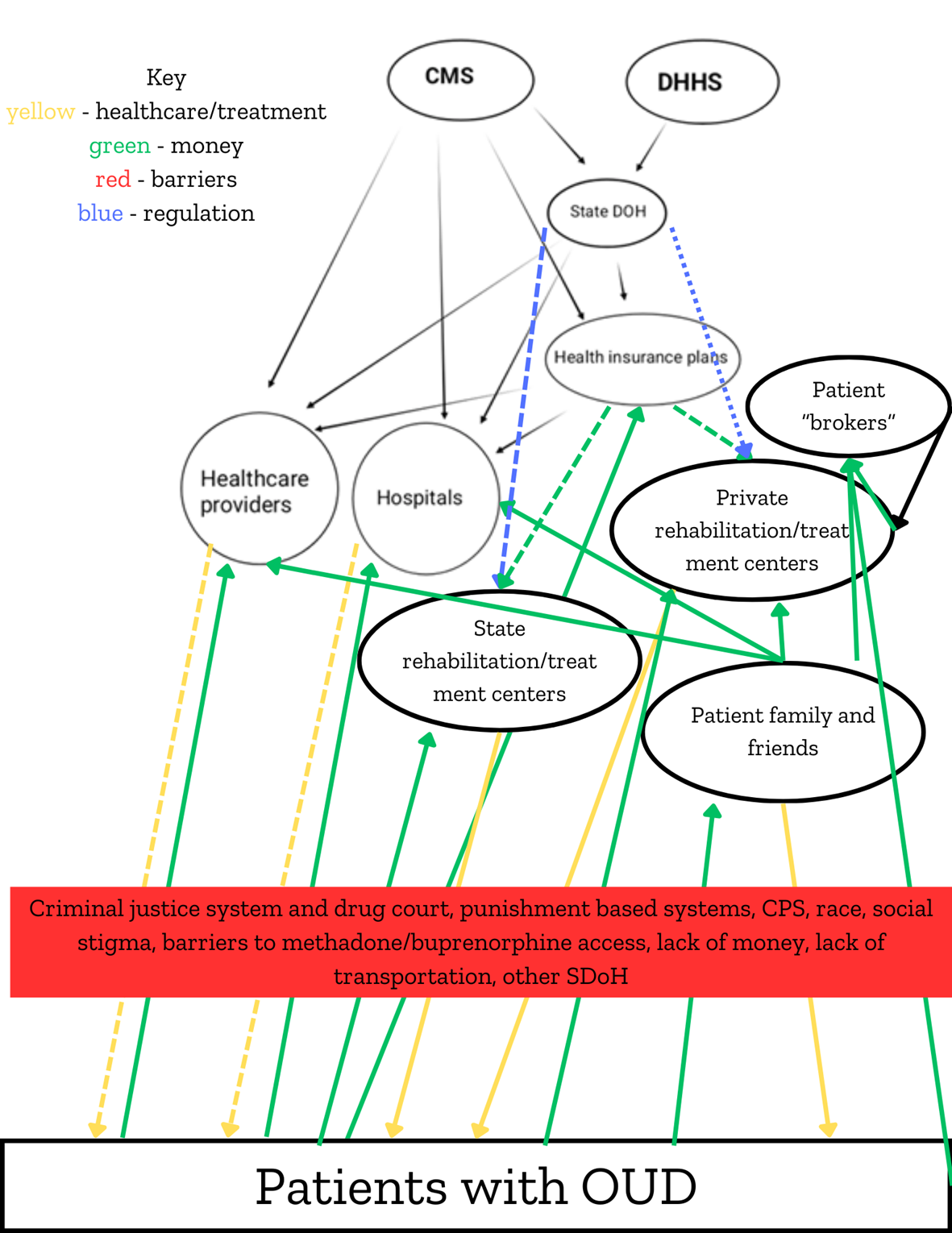
I chose to add patients with OUD to the figure in the largest font with a differently shaped box to highlight that the entire system pictured is supposed to serve them. However, I also put them at the bottom of the page, with a large amount of space between them and all other parts of the network. Hearing the personal stories in the documentary made me reflect on how the complex web of the healthcare system is often so far removed from the patients it intends to serve. It was also fitting to put patients at the bottom of the figure with all of the other groups hovering above, as those with addiction have the least control out of all the other actors in the system.
I also included patients’ family and friends because they are integral to the care of those with substance use disorder. The yellow arrow from this group to patients indicates the care they provide. As illustrated in the video, a patient’s support network often provides the care that the system neglects to give. This includes forcing loved ones into treatment, driving them hours daily to get methadone, and even administering Narcan in the event of an overdose. Families of patients with OUD also finance addiction treatment, so there are various green arrows indicating the flow of money to the payers in the system. More green arrows indicate the flow of money from patients to treatment centers, insurance plans, and hospitals.
I included private and state rehabilitation/treatment centers because these facilities provide care for those suffering from addiction, as indicated by the yellow arrows. While hospitals and individual providers can also administer treatment for OUD, there is little space designed for OUD patients in these systems, hence the dotted yellow arrows. As heard in one mother’s story in the documentary, patients are often discharged from the ER with no continuity care established as soon as they are stable from an overdose. I found the documentary quote “(the) treatment structure is distinct from the healthcare system” to be very compelling because it demonstrates how the treatment of OUD is relegated to settings outside hospitals and the healthcare system.
The blue arrows indicate state DOH regulation over state and private facilities. As mentioned in the documentary, there is often little oversight here, which has led to widespread abuse and neglect. The dotted blue arrows indicate that this regulation is inadequate, with smaller dots leading to private facilities as they have even less regulation than state-run facilities. I added a bubble for the often corrupt patient “brokers” who direct patients to facilities for their profit.
The big red box represents the numerous barriers that prevent care from getting to patients. As mentioned in the documentary, only 1 in 10 patients with addiction receive the treatment they need. This is astounding because I cannot think of any other health concern with known, evidence-based therapy with such a shockingly low rate of adequate treatment. Numerous barriers prevent OUD patients from getting the care they need; these include the punishment-based systems of drug court and CPS, the social stigma surrounding addiction, methadone prescribing restrictions, lack of funds or transportation to get treatment, race, and many other social determinants of health.
In sum, this exercise helped me realize how the disjointed and corrupt OUD “treatment" system consistently fails patients and their families.
Post a comment